The Lobby
What is the Lobby?
The Lobby is a place in the app where players meet in preparation of online games. It’s a bit like in a hotel lobby: it’s an open place where people hang around and talk together. Eventually some players organize an online game after agreeing on the number of players, the game settings, etc., then one of them creates a game and the others join it.
Why a Lobby?
As explained in Turn-based Online Gaming the Right Way, the Lobby is a key UI component in achieving successful online gaming. Its main virtue is to resolve the problem of creating online games even in the case of low traffic - which can unfortunately happen in the world of boardgames.
Why does it work? Because it allows players to get a feel of the traffic and discuss together to set-up a game - even if there are only 5 people connected. Other solutions like auto-match, modal dialogs workflows, etc. fail miserably - we know, we tried them.
Players want to have control about the type of game that they will join or create, so you need to show a list of open games with each game settings, who is already in the game, etc. Allowing people to chat in the Lobby will allow them to organize their games with the right parameters, decide if they want do to a 2 or 3-player game, etc. It helps a lot smoothing the organization of games.
Last but not least, the Lobby is also a very powerful tool to build your community of players. Players will meet online and make friends. In Ticket to Ride, we even had two couples who got married after meeting in the chat!
“If it isn’t broken, don’t fix it!”
Since the day we started doing online gaming (2003), we have tested a number of different solutions and user interfaces, and we failed a lot. The design described here is the result of these trials and errors. We know it works. So let’s not re-invent the wheel and stick to what works. Designs that differ too much from our template will be rejected.
Features
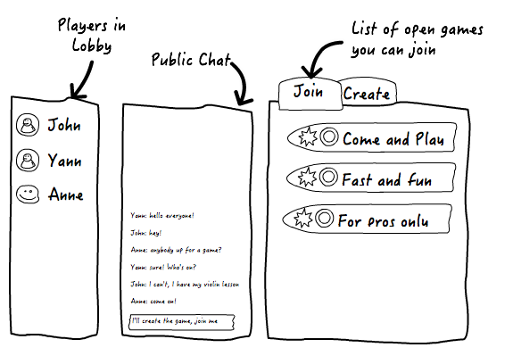
Typically, a Lobby provides the following features:
- A list of the players who are connected to the Lobby (i.e. they are not playing in a game).
- A chat area allowing people to exchange public messages.
- A list of open games, waiting for players to join them.
- The possibility to create a new open game.
It is key to show the three first items on the same screen. Why? Because you need the three to be able to decide with whom you are going to play and if you are going to join an open game or create a new one.
Layout
Here is a typical layout:
For example, here is the implementation in Small World 2:
And here is the one (a bit more complicated) from Ticket to Ride. You will notice that the order of the three panels is different. Ticket to Ride has tons of features, so it starts to become tough to squeeze everything in the screen space:
Let’s focus on each block one by one.
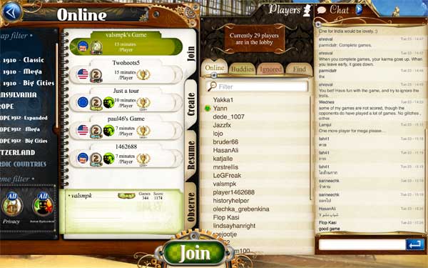
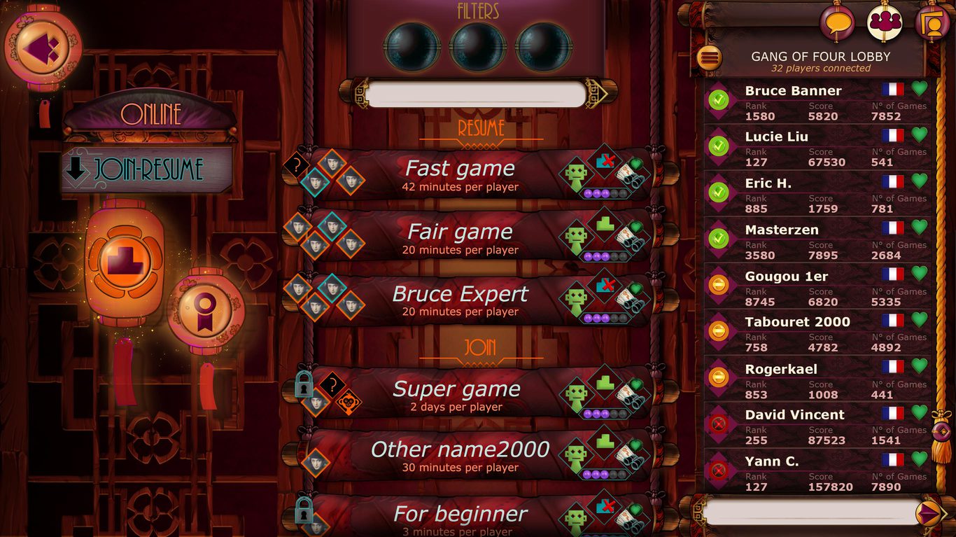
The Players List
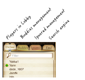
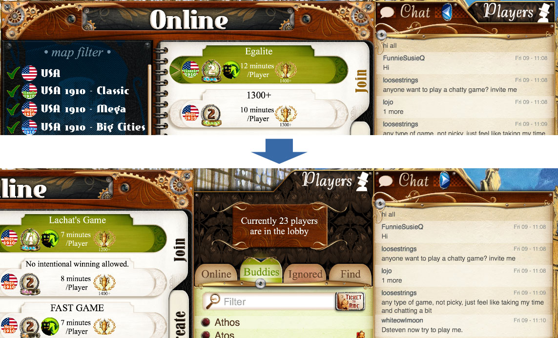
It is a good idea to indicate the number of players currently present in the Lobby. A filter search box is convenient to find a specific user when there are lots of them.
In the players list, indicate with an icon the ones that are the user’s Buddies and the ones that are on her Ignore list. This will allow the user to spot her friends quickly. See the iconography page for icons ideas.
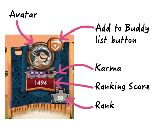
When a player is selected, display information about him in a small panel: users are always fond of stats: ranking score and rank, Karma, avatar, number of games played, latest achievement, last connection time, language, etc. - any information relevant to your game that will help the user know the player better and decide if she wants to play with him.
This is also a good place to put some basic user management, like a button to add the player to the user’s Buddy list - or Ignore list.
Example in Small World 2:
You can also implement a more sophisticated user interface, with a real management of your Buddy and Ignore lists, and a search engine to find players in the entire Asmodee.net database. We recommend that you take a look at Ticket to Ride, by far our most advanced showcase:
The Public Chat
This is very classic. A scrolling area of text, with messages piling up from the bottom, so that a discussion can be read naturally from the top to the bottom. The text input box should be at the bottom, since this is where the user’s message will pop-out.
For each message, you should indicate a timestamp and the player’s name. Again, look at Ticket to Ride for inspiration:

It is important that your UI design is compact enough so that you can display at least a dozen of messages. And provide a scrolling area to allow the user to look higher in the messages history. This way a newcomer can move up and read a complete thread. Often discussions are cross-mixed, so one may need to scroll up significantly.
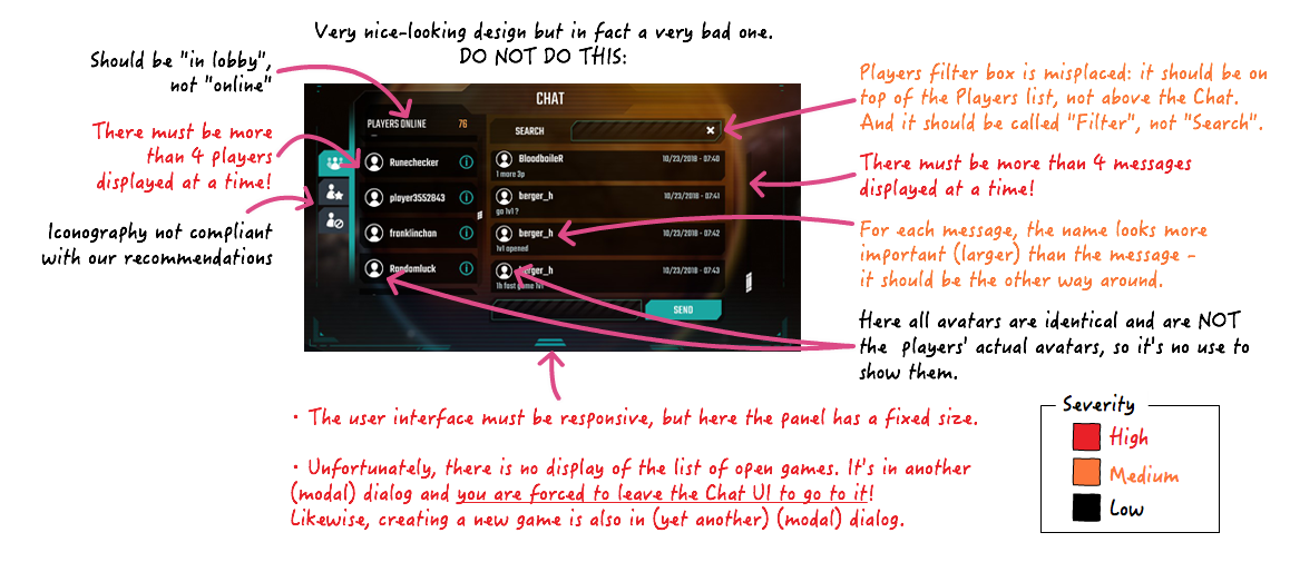
Remember, the text is what matters here. Please don’t do this (click on the image to zoom-in):
The List of Open Games tab
If there are some open games waiting for players, this tab should be displayed by default when the user enters the Lobby: we want to encourage newcomers to fill in open tables.
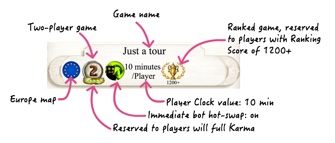
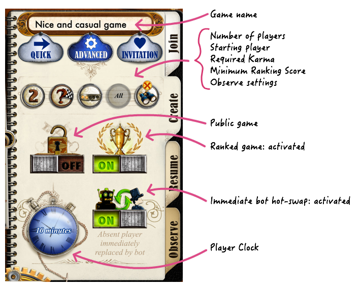
Each open game should display a number of properties that you find in all Asmodee.net games:
- Name
- Number of players
- Ranked or un-ranked
- Synchronous (aka “immediate bot hot-swap”) or asynchronous
- Player clock
- Public or private (protected by a password)
- Minimum Karma to join the game
- Minimum Rank Score to join the game (if a ranked game)
In addition to this, display any additional piece of information that is relevant to your game. For example, if a DLC is required, etc.
Example - again, with Ticket to Ride:
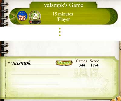
When a game is selected in the list, you should display in a sub-panel information about the players who already joined the game. This is important for competitive players who will want to balance the opportunity and risks of joining the game.
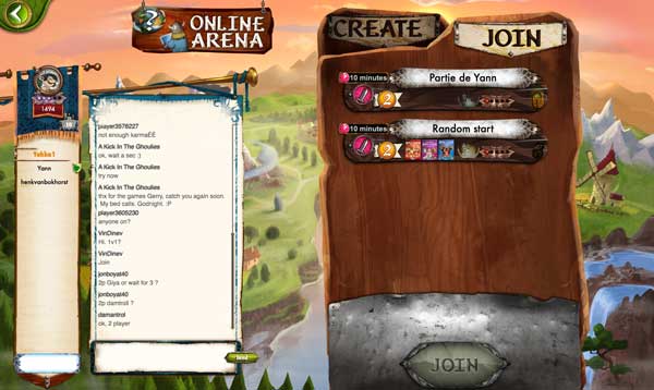
Here we can see the stats of the player called “valsmpk” who created the selected game: full Karma, 344 ranked games and a Ranking Score of 1174:
The Game Creation tab
The Game Creation tab should be displayed by default when the user enters the Lobby only if there are no open games to fill.
The parameters are the one listed in the previous section, with any additional ones that are specific to the game.
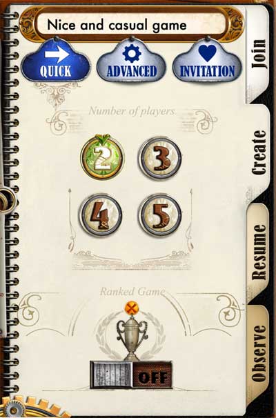
These are a lot of settings, and it can be intimidating! You can also provide a “Quick” simplified interface, using default values:
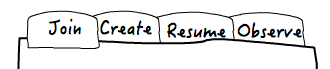
The Resume and the Observe tabs
Advanced games will also provide a “Resume” tab and in some cases an “Observe” tab:
The Resume tab
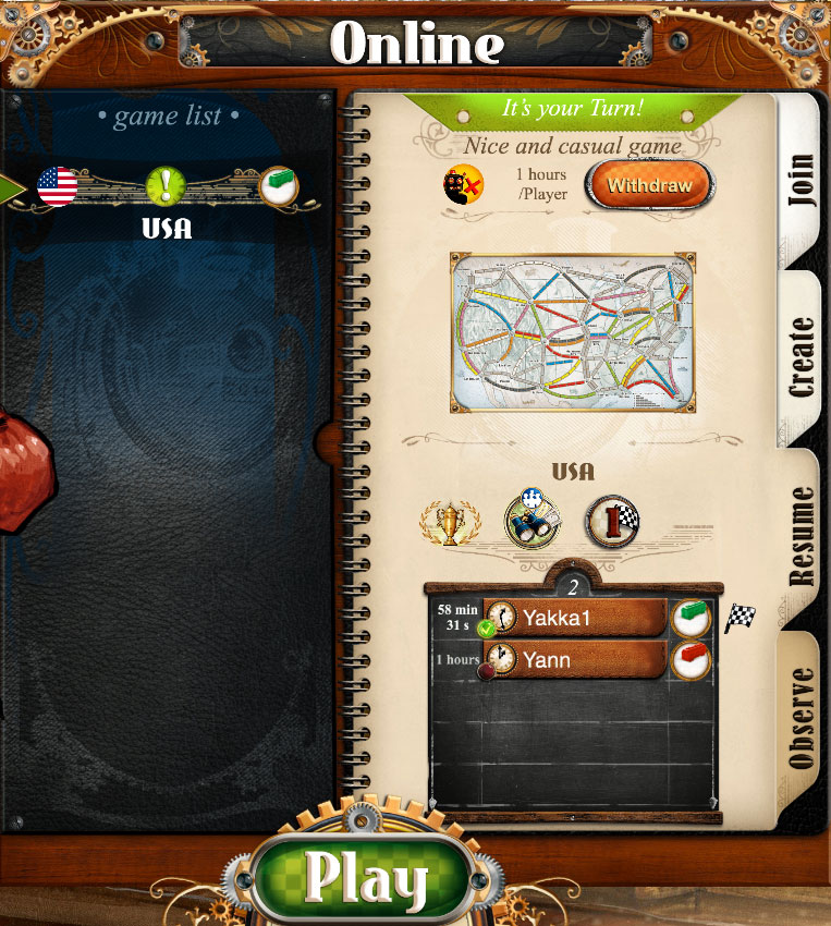
Games that provide Asynchronous Gaming will need a “Resume” tab. This tab contains the list of on-going games that the player is conducting in parallel. It is quite similar to the list of Open Games, except that for each game you should indicate the amount of Player Clock that remains for the player, and have a big “it’s your turn!” indicator if it’s the player’s turn - remember, the clock is ticking in this case! Also, provide a “Withdraw” button to allow the player to forfeit (display a warning alert if he uses this button, as he will lose Karma and Ranking!).
One tip: we wrote earlier some recommendations about which tab to display by default when the user enters the Lobby. If you have a Resume tab and that there are some on-going games for the user, you must display this tab first! This is because you want the player to finish his ongoing games in priority before joining or creating any other games.
Here is the example of Ticket to Ride. The list of games that can be resumed is displayed on the left. The panel shows details about the selected game. Note the green exclamation mark icon on the left and the “It’s your turn” label:
The Observe tab
The “Observe” tab is an advanced feature. It is nearly identical to the list of open games, but it shows games that are fully filled and are currently played by other players. The player is allowed to jump into a game and watch it in real time. It is useful to allow beginners to learn the game by watching others play. It is also very important for online tournaments, because it allows other players to watch important matches.
Be careful though, do not turn it into a way to cheat. Since an observer would watch one of the player’s game like if he was “over his shoulder”, you don’t want to reveal sensitive information like his hand of cards for example. Here are the options found in Ticket to Ride:
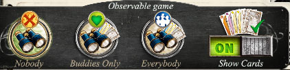
When creating a game, you can forbid the feature, or open it more or less. A separate button also allows you to reveal or not your hand of cards.
Alternative Designs
Screen real estate is always an issue, so here are some alternative designs.
Combining the Chat and the Players list: it’s OK to combine the Chat and the Players list, as long as you remain in the same screen and that the list of Open Games remains visible at all times. Again, Ticket to Ride if a good example of this approach, even though it goes the extra mile of providing an expand button to make the two things visible simultaneously by sliding some (less important) panel to the left.
Combining the Join tab and the Resume tab: if you don’t support the Observe feature, it is possible to combine the Join and the Resume tabs together if it does not make the UI too complicated. This is an acceptable design for simple games that don’t need a very specific and/or sophisticated UI for on-going games. Here is an example with Gang of Four:
As you can see, the list is split in two sections, the first one showing games that you can resume, and the second section showing open games you can join. If there are no on-going games, hide completely the “Resume” section.
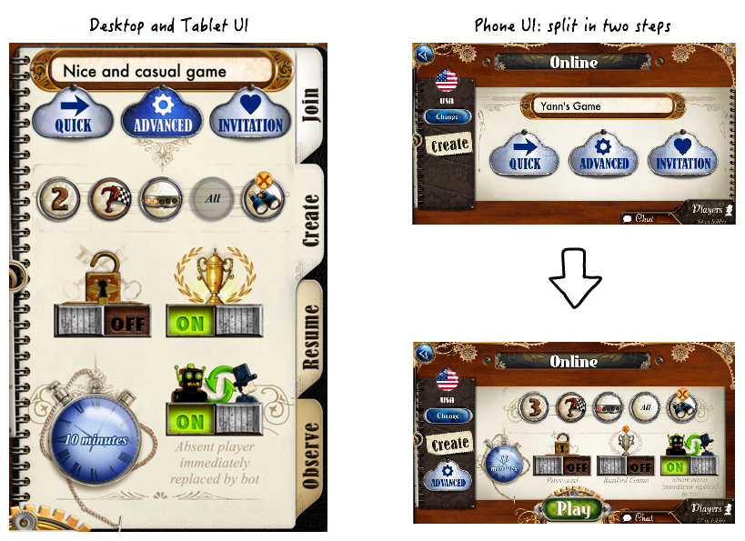
A note about mobile (phone) design
The case of small phone screens is always a headache because there is simply not enough space to fit all this! So hard choices are to be made.
First of all, consider that the use of a mobile phone is quite different from the use of a PC interface. A mobile user wants something simple and quick, with lots of preset parameters, as opposed to a PC user who will enjoy dashboards that look like a B-747 cockpit. So simplify the user interface. When you cannot remove parameters, split a complex dialog into successive simple screens. Ticket to Ride makes a very clear demonstration of this in the online games creation user interface. Make sure you study it: