User Interface Guidelines about the iPhone X
This document gives some recommendations on how to handle the iPhone X layout.
The iPhone X design has specific UI constraints:
- It is a “bigger” stretch of proportion. It is almost a 16/7 display.
- There are overlay constraints with the phone camera and the OS menu.
NB: Those new constraints will also be valid for other mobile devices that might follow the iPhone X design.
Display
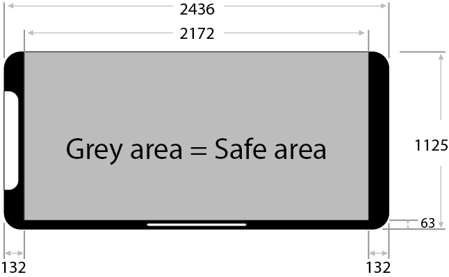
| General Resolution | 2436 x 1125 |
| Safe Area | 2172 x 1062 |
| Left & Right Insets | 132 |
| Bottom Inset | 63 |
| Top Inset | 0 |
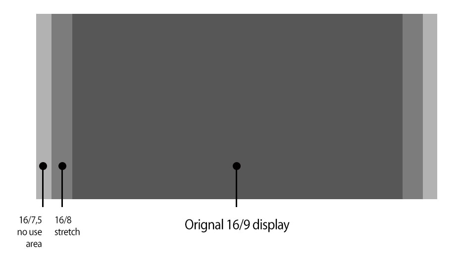
If you are adapting from a 16/9 ratio you can extend the background to cover the whole screen and keep the information and interaction in the central Safe Area. The screen content should not extend further than the “16/8 area”.
Other specific display for iPhone:
- Do not hide the status bar or include it in your UI design
- Do not design anything including the camera shape

Usability
Do not put any interactive element outside of the Safe Area:
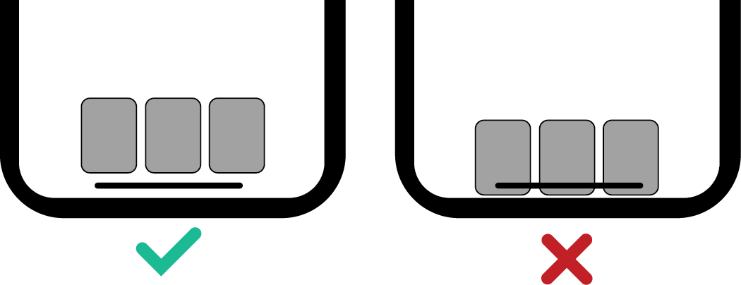
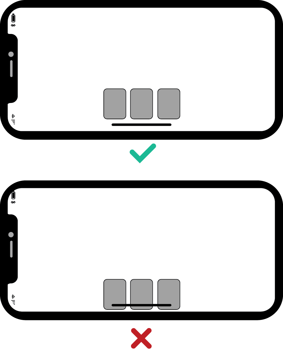
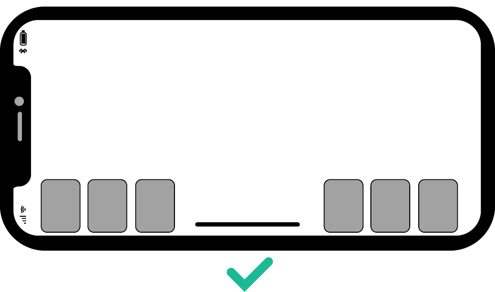
And in some very specific cases, if there are no other ways around, some elements can be displayed in the menu area, but only on the side. Most of the interactive touch must be inside the Safe Area:
Any drag-and-drop action in the OS menu area should be avoided:
