Integrating the Cross-Promotion in your App
The Cross-Promotion is an important feature in all Asmodee.net apps. This enables cross-fertilization between all apps. The traffic of a successful app will help the business of all other apps because the player will discover them thanks to the Asmodee.net cross-promotion tools.
The API offers 3 types of cross-promotion features. Depending on your case, you will implement one, some or all of them:
- A classic banner ad to display inside your app.
- An interstitial ad that appears temporarily during the UI workflow and that the user can close only after a short delay.
- A full panel that is usually open through a “More Games” button in the app.
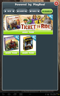
Which one(s) should you use in your app? It depends on the type of app you are doing. Obviously a premium app won’t use ads, it will only use the “More Games” user interface. See with your business contact at Asmodee Digital which feature(s) you should use for your app.
All this content (assets, links, etc.) is delivered dynamically by the Showcase end-points of the REST API.
If you are using the Asmodee.net Unity SDK, you have a fully functional example ready to use. Check out the details on the Asmodee.net Unity documentation for installation and use.
If you are not using our Unity SDK, the following sections of this page will give you guidelines to help you implement your own version.
One last notice before jumping into more details: the look-and-feel of the demo APK and of the SDK example are for illustration only. We recommend that you “skin” the user interface to adapt it to your app graphic style. The SDK sample provides some skinning capabilities to do this by the way.
Displaying a banner ad
The Showcase banner end-point allows you to get details about a banner to display. Among other things, the url of a 980x196 px JPG file will be returned in the banner_url field.

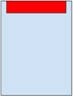
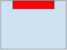
Banners have a 5:1 ratio and must be displayed undistorted. This is optimized for a portrait display on a 16:10 screen (see illustration below).
The height of the banner must be exactly one eighth of the longest screen dimension. So in pseudo-code:
var banner_height = max(screen_width, screen_height) / 8
Since the height is fixed, the width can overflow on narrow screens, like 16:9, so banners have a “safe zone” of 49px on the left side and the right side of the image. On 16:9 or narrower screens, this zone is hidden.
Whatever the type and size of the device screen, it is expected the banner image to be displayed unstretched, either at the top or the bottom of the screen, and horizontally centered.
Examples:
| 10:16 screen | 16:10 screen | 9:16 screen |
|---|---|---|
 |
 |
 |
| 16:9 screen | 3:4 screen | 4:3 screen |
 |
 |
 |
The display of a banner should be tracked in Amplitude. Contact us to get the details of implementation.
Displaying an interstitial
The Showcase interstitial end-point allows you to get a list of products to be displayed in an interstitial window, filtered by channel and language. An interstitial must be displayed at least a few seconds before it’s possible to close it. The list returned is a short list, short enough so that no scrolling should be necessary to view all products.
Assets are designed to fit in a 3-column grid:
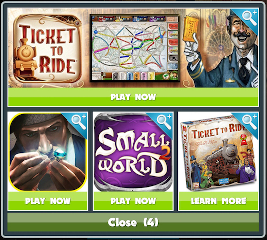
You will notice the count-down at the bottom before the “Close” button becomes enabled.
More info about the dynamic grid layout can be found later on this page.
 The button can show either “PLAY NOW”, “LEARN MORE” or “COMING SOON”. If the
 shop_digital_url field is not empty, it
should read “PLAY NOW” and take directly the user to the url if she presses the button. If the shop_digital_url field
is empty the button should read “LEARN MORE” instead, or “COMING SOON” if the status field is equal to soon, and take
to the product detail view (see below).
Note that pressing the image itself always opens the product detail view, regardless of the shop_digital_url
field:
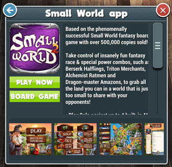
The back button takes back to the previous panel. The close button completely dismisses the whole thing.
More info about the product detail view can be found later on this page.
The display of a interstitial popup should be tracked in Amplitude. Contact us to get the details of implementation.
Displaying the complete “More Games” panel
This is the most complete user interface of the Cross-Promotion. It provides a complete panel, divided into categories, allowing the user to explore the various digital and physical games showcased by the API. It uses the Showcase request games end-point to get a list of products to be displayed in a “More Games” screen or window, filtered by channel and language.
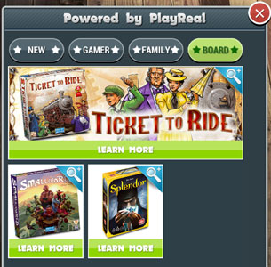
At the top, you have buttons to reduce the number of items to display by filtering them by categories. “New”, “Gamer”, “Family” and “Board”. Each of them corresponds to a tag in the end-point call.
Like with the interstitial, pressing a tile opens the corresponding product detail view (see below). The logic of the “PLAY NOW”, “LEARN MORE” or “COMING SOON” button is exactly the same as with the interstitial (see above).
The display of a “More Games” popup should be tracked in Amplitude. Contact us to get the details of implementation.
The 3-column grid system and the dynamic layout
The display is organized in a 3-colum grid that grows vertically. It is filled with tiles. There are 3 types of tiles:
- 1x1
- 3x1
- 2x2
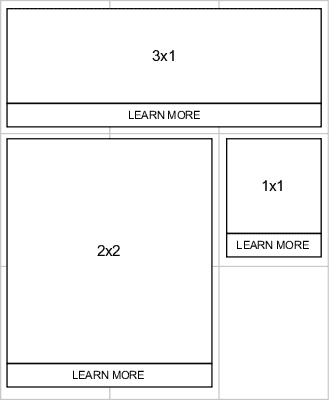
Note that the 1x1 tile image is square, but the cell itself is rectangular because of the space taken by the “Learn More” button below each image and the little padding allocated to have something that looks nice.
Layout Algorithm
We recommend that you display tiles in the order returned by the API end-point, because this allows us to “feature” a specific product by putting it first. The algorithm fills the grid from left to right, then top to bottom, finding the next available cell(s) that can accommodate the tile.
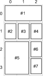
The idea is to have a “bitmap” of the cells, and mark them as they are filled. Here is the algorithm in pseudo-code:
    COLUMNS = 3     # Width of the grid
    ROWS = 100  # Maximum number of rows of the grid
    cells = boolean[COLUMNS,ROWS]  # Grid of cells

    for each tile
        (col, row) = search_space(tile.width, tile.height)
        if (col, row) != (null, null)
            place tile at (col, row)
            mark_space(col, row, tile.width, tile.height)
        end if
    end for

    function search_space(width, height)
        for (row=0; row<ROWS; row++)
            for (col=0; col<COLUMNS; col++)
                if is_space_available(col, row, width, height)
                    return (col, row)
                end if
            end for
        end for
        return (null, null)
    end function

    function is_space_available(col, row, width, height)
        for (c=0; c<width; c++)
            if col+c >= COLUMNS
                return false    # We failed: no space left on the right side
            end if
            for (r=0; r<height; r++)
                if cells[col+c, row+r] == true
                    return false    # We failed
                end if
            end for
        end for
        return true     # Success: space if available, all cells were clear
    end function

    function mark_space(col, row, width, height)
        for (c=0; c<width; c++)
            for (r=0; r<height; r++)
                cells[col+c, row+r] = true
            end for
        end for
    end function
Generally speaking, make sure that your user interface is flexible and re-adapts itself dynamically if the user rotates the device or change the screen resolution.
The product detail view

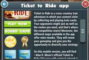
There are several elements to place in this panel.
- The panel title with the game name (
namefield), and a back and a close button. - A vertically scrollable area with:
- The icon on the left side (
icon_urlfield). - The “Play Now” button to go to the digital store, if the
shop_digital_urlfield is not empty. - The “Board Game” button to go to the Web site or store of the physical game, if the
shop_physical_urlfield is not empty. - The awards displayed below the buttons, if any (
awardsfield). - The description on the right side (
descriptionfield).
- The icon on the left side (
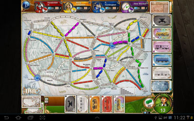
- A scrollable horizontal list of additional (and optional) illustrations (
images) and videos (videos) at the bottom. Pressing one of this item “zooms” it by opening it on a larger overlay above the panel. Push on the zoomed image to dismiss it and go back to the detailed view.
Scrolled top area:
Scrollable horizontal list of illustrations:

Zoomed illustration:
A few last details
As with all the REST API end-points, you will need an OAuth2 Access Token to talk to the Showcase end-points. If you don’t
have one, create a public one using the public OAuth2 token request. If
you already have an Access Token, there is not need to create another, use the one you have, even if it has a private
Scope (i.e. the user is identified). Knowing the user will allow the server to customize the content. For example, the
latest Ticket to Ride DLC could be put forward to a Ticket to Ride user.
Cross-promotion in a Webview
For convenience, we provide a URL with an HTML & JS version of the cross-promotion, targeting webview usage. If you are
not using the Unity SDK that we provide or you don’t have the time to develop a native
interface, you can use a webview to call the following URL: https://crosspromo.asmodee.net.
You must pass 3 parameters in URL query:
- channel: string, mandatory, the store for the current device, same as those listed here
- lang: string, optional, default is
en, the desired language for the returned product. Must be a valid ISO_639-1_alpha-2 language code. See ISO_639-1 codes - access_token: string, mandatory, the OAuth2 access token of the current user. (cf. A few last details)
Example:
https://crosspromo.asmodee.net/?channel=appstore&lang=fr&access_token=ej[...]
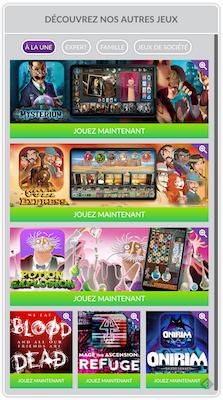
Nota bene: We recommend using a native version in your app or the Unity version provided by our SDK. The Webview version is not customizable and can bring the user out of her gaming experience with your application. It is just a quick solution if you are running out of time.