Art Direction & User Interface
The purpose of this document is to explain the artistic and user interface approach at Asmodee Digital for taking a board game and moving it to the digital space. This guide is intended to studios who work for Asmodee Digital.
Preliminary Evaluation
Before doing anything else, it is important to understand the context of the original board game and what makes it unique and attractive to the players. It could be the artwork, the theme, the game system, the cultural trend, etc. - or a mix of all that.
If you don’t do this work, you won’t be able to understand what “being faithful to the original game” means from the point of view of the community.
A good way to do this is to read the community forums: the publisher’s forums (when available) and the forums and ratings of Board Game Geek. These are great resources to understand what matters to the players. And of course, play the board game - a lot!
The Art Direction
Define your Art Direction
Identify what the digital “art direction” is, considering the original board game art direction.
Is it an adaptation without new content? Do we extend the art and add new elements?
Are we adapting it to a new audience? Are we completely changing it?
Find the seed of your creation
“out-of-game”: all the screens the user encounters before starting a game and after finishing it.
“in-game”: all the screens the user encounters once inside a started game.
According to where you stand from the original board game art, create two screens: one “in-game” and one “out-of-game”. In addition write a short definition of your intention. Use words that summarize what you try to convey ei: sharp, aggressive, dynamic or pop, funny, light.
Try to define your UI intention in one short sentence, for example “we are inside a gloomy pub” or “I am in a fresh natural open environment”. It will help to lead the whole UI on the same tone.
These 3 elements (the two screens and the intention definition) will be very helpful to not lose track of your original intentions and stay coherent. Then it will be very useful to assess new visual contents and still remain coherent.
If necessary, also create visual mood board of textures, colors, environments, other game UI, film references, music… that you can also go back to during your art development.
Make the extra polish
If you have time and budget, add visual effects and some animations. It can help to resolve design problems and enhance the immersion. Note: Visual Effects, animations and UI tricks will be covered in more details by a separate document if necessary.
User Interface
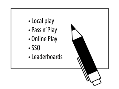
Step 1 - Features and Content List
List all the game and player needs, “out-of-game” and “in-game” (from the back button to the detailed leaderboard information).
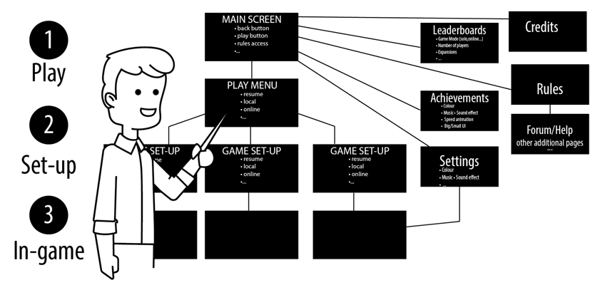
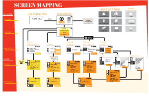
Step 2 - Create a mapping of all the screens
Organise the features list (step 1) through different screens. Create a diagram showing them all and their connections. This diagram is called the “Wireframe Workflow”. You can use our preset template to help you get started and be more consistent with the other Asmodee games.
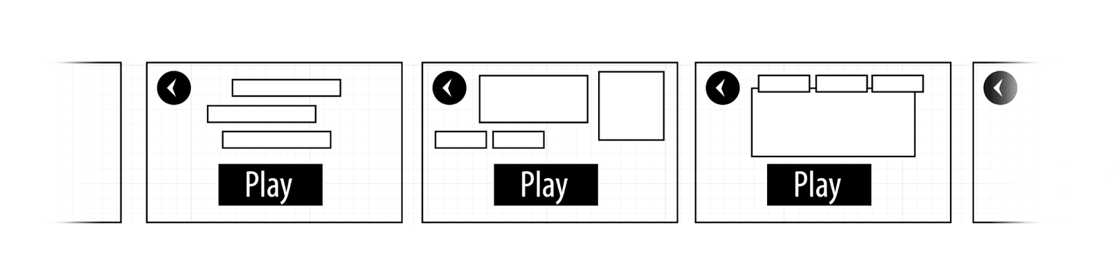
Step 3 - Layout of each screen
Each screen design should start with the layout of the UI. Compose the screen content with usability in mind. At this point, it is more a matter of space and layout than look-and-feel.
- Place all elements in the screen to apprehend the space occupation and add additional screens if necessary (e.g. it might change if it is for mobile devices: more screens than on desktop or tablets - see the “UI from mobile to desktop” paragraph in the “UI Tips” section later in this document).
- Identify information through use, theme or logic and gather them accordingly.
Is the information related to another piece of information or to an action?
- Create a hierarchy through composition and proportion. Colors, effects or animations will come later, use pencil drawing.
What is the first thing the user should see? How do I guide her through the screens?
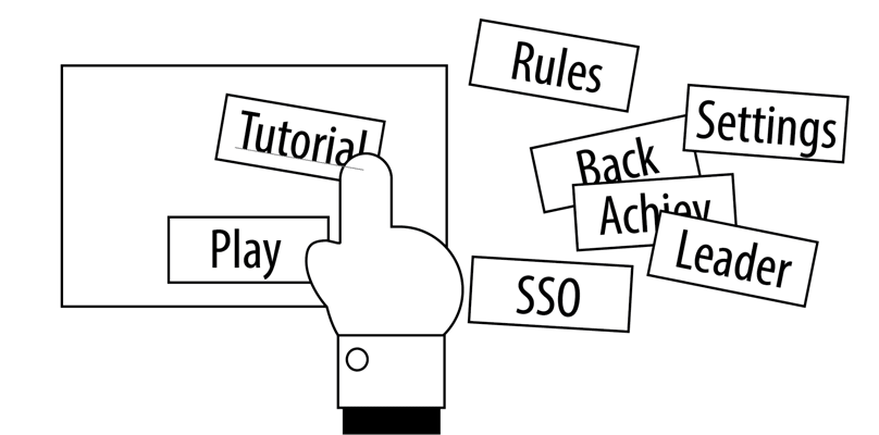
Step 4 - Create the typical tunnel
The user should not be searching for the next action that will make her progress through the UI.
Try to create a “typical” tunnel of use. Place the UI elements shared throughout the various screens always at the same place.
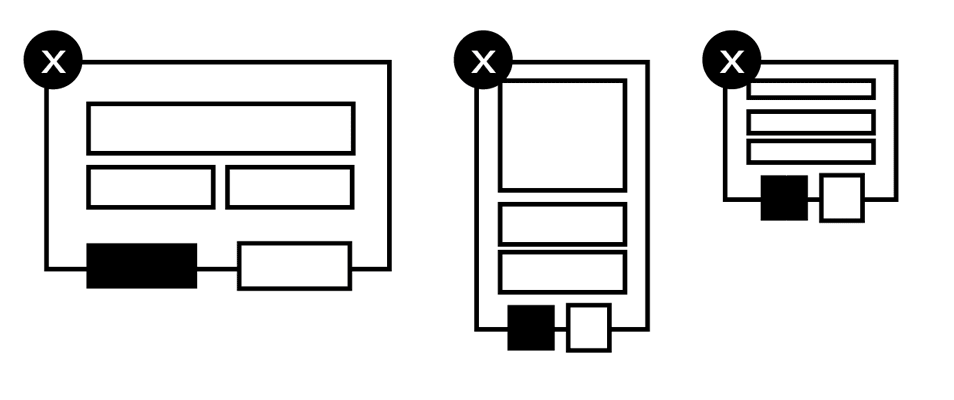
For example place the main master buttons always at the same place like “play” or “back”:
Step 5 - Make the layout consistent
Create a library of elements.
- Most of the information or interactive elements are repeated in different states or places.
- Design them according to each other. For example, make all the validate buttons green and place on the bottom right. Make the invalidation/cancellation ones in red and place them on the left.
- See if an element has different states: on, off, disabled, claimed, done… and make those states logical to each other.
- See if an element in a group of items has different sizes and make its design adaptive:
- It’s also OK to design variations of the same UI element depending on the different screens it appears on. Depending on the context, this UI element would display more or less information. The key thing is that the user should keep recognizing it quickly and easily, and find the information he is looking for. The solution is to make the different variations look-alike design-wise and layout-wise.
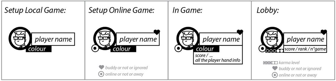
A common example of variations with consistency is the player’s information widget:
Step 6 - Prototyping
Now seems a very good time to create a quick prototype with all the screens mock-ups.
It will help to experience the screens flow, its logical use and UI placement.
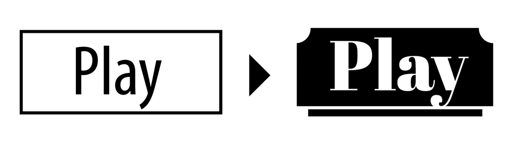
Step 7 - Design it beautiful
Use the 2 screens fully rendered from the Art Direction proposition and apply it to all the screens.
Create a visual language, and make it coherent.
UI Tips
The key concepts are: layout, space, contrast and hierarchy.
Mapping (step 2 above):
This step is important. It will create a visual map of all the “out-of-game” screens. It will help you to have an instant global vision of the entire game. Download our template:
You can also map the “in-game” screens. It will help you identify:
- the sequence of actions (game flow)
- see the key features
- detect friction points
Out-of-game:
Do not underestimate the “out-of-game” part. It contains a lot of screens that expand the game experience. It should allow the player to start a game quickly but at the same time allow her to tailor one to her liking.
Consistency:
Don’t change the place of a button. Create invariables in colors, shapes and places. Try and create a visual language dedicated to the UI but still coherent with the Art Direction of the game.
Multiple Platforms Support (aka responsiveness):
Support from mobile to desktop:
- The context changes: the player is less distracted on a desktop than a mobile. You will need to have information and action reminders for mobile.
- Mobile users are more used to split information on several screens (sequenced) than desktop users who accept a lot more information on one single screen.
- On mobile, the user uses fingers as opposed to a mouse pointer on desktop. The assets will not have the same proportions and size. Same thing for text. Desktop has an “hover” state on UI elements, tooltips, shortcuts. Mobile has more processes of interactions (pinch, drag, slide…) and so on…
- Be careful with the border of the screen on mobile particularly the top of the screen (overlay mobile menus, iPhone X with “dead” zones).
Screen ratio from 4/3 to 16/9:
- Search for the most common ratios on mobile and desktop. Then design perfectly for the most common one and adapt the best you can to the others. Keep in mind that there is no such thing as “standard screen resolutions and pixel sizes”. Your UI MUST adapt itself.
Screen orientations: decide of you accommodate landscape, portrait or both.
UI from mobile to desktop:
If you consider designing your assets for both media, doing so straight from the beginning will save you a lot of time (especially for the out-of-game screens).
The switch from mobile to desktop is often a matter of proportion:
- Use the same buttons but make them smaller on desktop
- You can have a lot more information displayed on desktop screen than mobile. For example in UI panels. Or in lists (more items because they can be smaller)
- The text is smaller on desktop and so are dialog boxes
- Think about the usability of mouse and keyboard » integrate over, tooltips, shortcut
- …
Text:
- Make it proportional to you support: small for desktop and big for mobile.
- Make it readable: contrast, kerning and aligned paragraph of text.
- Hierarchy: differentiate interactive ones from static ones.
- You MUST support copy/paste on desktop.
Plan ahead:
Once finished, the game could have additional developments that will affect the UI. Try and make it part of your thinking when taking layout decisions, so that you have some room for future additions.